I know a lot of people don’t like the Ribbon, but I personally love it. It’s being put into more and more of Microsoft (and third party!) applications and SharePoint 2010 is no exception. But how do you go about and customize it? I’ve been looking at doing so for the last few days, and I’m glad to say that so far it’s not too tricky.
I’m thinking I’ll probably do a few blog posts on this, but I’m going to start out really simple. I wanted to find out how to add a new button (or control in general) to an already existing tab group on the Ribbon using a feature. This would be a good way of doing it if you are extending functionality that you want to be permanent. I believe you can also customize the Ribbon programmatically from a web part, which would allow you custom behavior only when that web part is visible.
Anyway, I started out by creating a new empty SharePoint 2010 solution.

After that it asked what type of solution it wanted me to make. For my purpose a sandbox solution was going to be sufficient, so I went with that.

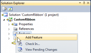
OK. At this point I had the new solution all set up. Now I just needed to create a new feature in the solution. This was as easy as just right-clicking on the feature folder in the project and clicking Add Feature. If you’ve done any development on 2007, you’ll appreciate that this is a lot easier to do than before.
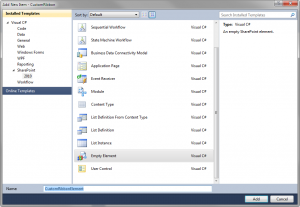
After I created the feature I had to add the elements file. I did this by right-clicking the project and click Select -> New Item.

I then selected the Empty Element template and gave it an appropriate name.
At this point my solution had all the files that were needed to create our feature.
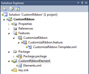
Well that’s all well and good, but I needed some meat to the elements file for this to work. So I headed over to MSDN and dug out some articles on how to customize the Ribbon. Here’s the XML that I ended up with.
<Elements xmlns="http://schemas.microsoft.com/sharepoint/">
<CustomAction
Id="CustomRibbonButton"
Location="CommandUI.Ribbon"
RegistrationId="104"
RegistrationType="List">
<CommandUIExtension>
<CommandUIDefinitions>
<CommandUIDefinition
Location="Ribbon.ListItem.Manage.Controls._children">
<Button
Id="Ribbon.ListItem.Manage.Controls.TestButton"
Command="ShowAlert"
Image16by16="/_layouts/images/actionseditpage16.gif"
Image32by32="/_layouts/images/actionssettings.gif"
LabelText="Show an alert"
TemplateAlias="o2"
Sequence="501" />
</CommandUIDefinition>
</CommandUIDefinitions>
<CommandUIHandlers>
<CommandUIHandler Command="ShowAlert" CommandAction="javascript:alert(‘Hello world!’);" />
</CommandUIHandlers>
</CommandUIExtension>
</CustomAction>
</Elements>
Let’s first have a look at the CustomAction element. This is the element that tells SharePoint that we want to add a custom action. Give it a unique name and set the Location to CommandUI.Ribbon. The RegistrationType and RegistrationId specifies when the extended UI should be visible. In my case I’ve set it to only be visible on Announcement Lists (it’s ID is 104), but you can set this to any kind of List, Content Type, File Type or ProgId.
Next up is the CommandUIExtension element. It contains the actual controls and actions that are to be taken with our custom action. More specifically, CommandUIDefinition contains the definition of the control, which is my case is a button, while the CommandUIHandler contains the information of what to actually do when the control is interacted with.
The Location attribute on the CommandUIDefinition element is what actually decides where on the ribbon our custom button shows up. You can check out this page on MSDN for possibilities of where to put it. I wanted it to show up in the items section of the ribbon, under the Manage group, so I chose Ribbon.ListItem.Manage.Controls._children.
Now we need to customize the button. First give it a unique Id. I like to use the location of the button with a name tacked at the end, but it’s entirely up to you. The Command attribute tells the button which action to call when it’s clicked. This is the action that we’re going to specify in the CommandUIHandler element. Give it a name, and make sure you use the same name later on. Next we specify a couple of image and a text label. The text label is what actually shows up as the text on the button. The TemplateAlias decides the size and styling of the button. I haven’t looked into this, so I left it at “o2” which is what the code sample I was looking at is using. Finally there’s the sequence attribute. This is what decides which order buttons show up in inside of a group. I believe I had this set to something in the 100 range at first, and I kept getting javascript errors whenever I went to the page where the button should have appeared. As soon as I set this to a higher value, the errors dissapeared. Seems to me that this value needs to be unique, so I’d suggest keeping it relatively high. I haven’t found any official documentation stating what it should be, but 501 seemed to work for me so that’s what I used.
Finally all we have left is to specify the action that’ll take place when we click the button. We’ll do this in the CommandUIHandler element. I’m went with a simple javascript hello world alert here, because I just want something easy to demonstrate that it works. Also, my javascript is fairly limited. Set the Command attribute to be equal to the Command attribute of the Button element. That’s what’s linking the two together. Then in the CommandAction put in the script that you want to be executed. There’s also an EnabledScript attribute that can contain a script that SharePoint can use to decide whether the button should be enabled or disabled. I’ve left that out of here because I want mine to be enabled all the time.
That’s it! Now let’s try it out. Time for some more pictures. Make sure your elements file is included in the feature.

Then make sure that the feature is attached to the package.
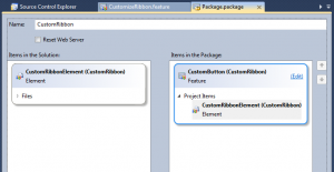
Then deploy the project to the server.

Now head into Site Setting -> Site features and activate your feature.

And finally, go to your announcement list to see the new button in action. If you don’t have an announcement list, you’ll need to create one (obviously). Click on the List Tools -> Items to see the button in all it’s glory (remember, we put it in Ribbon.ListItems).
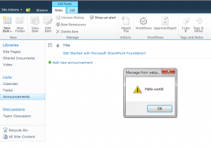
And that’s all there is to it. This is a really simple example, but hopefully it can be a stepping stone to get into the customizations you can do with the Ribbon. There’s a bunch of more things you can do, and I’m going to try and cover a few more in future posts.


Leave a Reply